
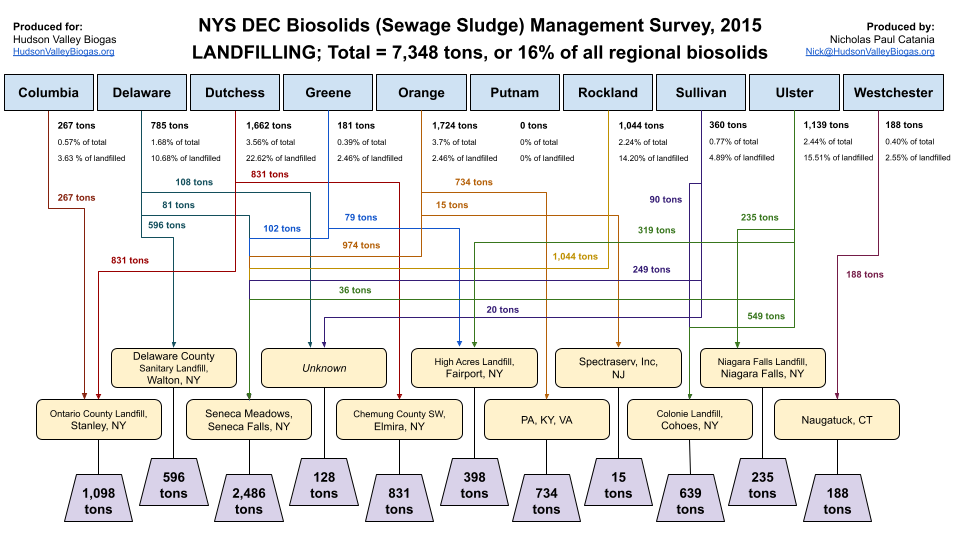
Biosolids Flows (2015)
County-level snapshots showing where biosolids went in 2015. Use these figures to identify leverage points for circular systems: routing, beneficial use, treatment upgrades, and community-first siting.
We map the flows so planners, engineers, and community stewards can see where biosolids move and where circular pilots can safely intercept, upgrade, and reuse the material.
How to read these charts
Each county image is a flow snapshot. The purpose isn't to memorize the diagram-it is to ask better questions faster.
Use the "4 questions" method
- What is the baseline? Where does biosolids go today (land application, landfill, incineration, export)?
- Where is value lost? Which flows are pure cost with high trucking miles or fragile permits?
- What is the constraint? Dewatering capacity, storage, seasonal land application windows, contamination, community acceptance?
- What is the smallest viable shift? "Move one arrow" with a pilot that can scale.

This hub will eventually host an interactive map (counties + facilities + candidate sites). For now, use the county list to navigate.
reports/county-biosolid-flows/Landfilled Biosolids, 2015.png